
t-Distributed Stochastic Neighbor Embedding (t-SNE) is an unsupervised learning algorithm used for dimensionality reduction and visualization of high-dimensional data. It maps multi-dimensional data to a lower dimensional space of two or three dimensions, which can then be visualized in a scatter plot.
The key hyperparameters of TSNE include perplexity (related to the number of nearest neighbors that is used in other manifold learning algorithms) and learning_rate (the rate at which parameters are updated during optimization).
t-SNE is particularly well-suited for visualizing high-dimensional datasets to identify patterns or groupings of data points.
from sklearn.datasets import make_classification
from sklearn.model_selection import train_test_split
from sklearn.manifold import TSNE
import matplotlib.pyplot as plt

# generate synthetic dataset with 3 classes
X, y = make_classification(n_samples=1000, n_features=100, n_classes=3, n_informative=10, random_state=42)

# split into train and test sets
X_train, X_test, y_train, y_test = train_test_split(X, y, test_size=0.2, random_state=42)

# create t-SNE model
model = TSNE(n_components=2, perplexity=30, learning_rate=200, random_state=42)

# fit model on training data
transformed_data = model.fit_transform(X_train)

# plot t-SNE visualization
plt.figure(figsize=(8, 8))
colors = ['red', 'green', 'blue']
for i, color in zip(range(3), colors):
    idx = np.where(y_train == i)
    plt.scatter(transformed_data[idx, 0], transformed_data[idx, 1], c=color, label=f"Class {i}", alpha=0.8)
plt.legend()
plt.show()
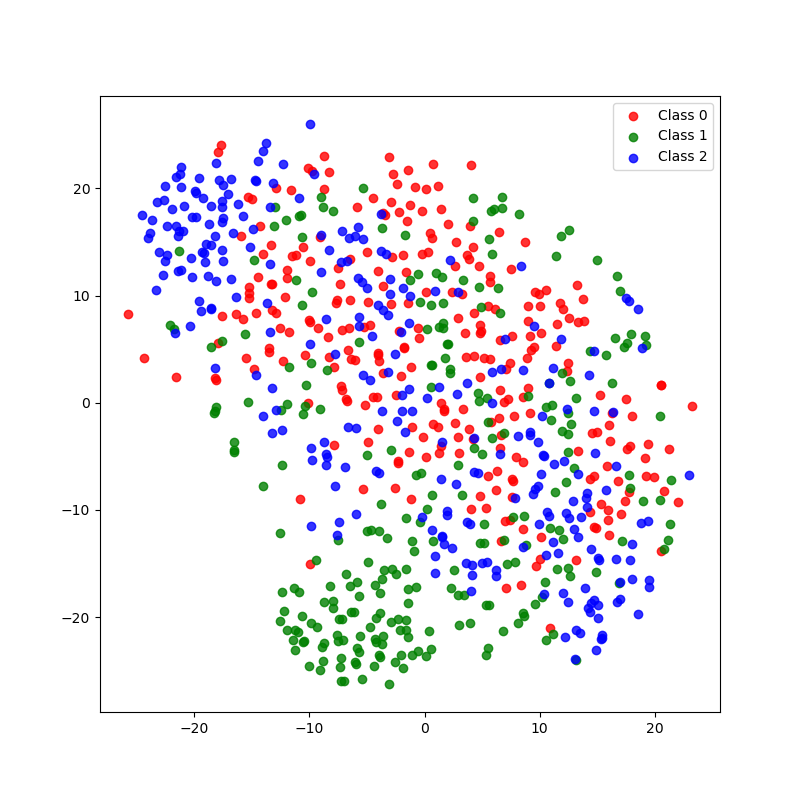
Running the example produces a plot the looks like:
The steps are as follows:
Generate a synthetic dataset with 1000 samples, 100 features, and 3 classes using
make_classification(). Split the data into training and test sets usingtrain_test_split().Create an instance of the
TSNEclass with 2 components (for 2D visualization), aperplexityof 30, alearning_rateof 200, and a fixedrandom_statefor reproducibility.Fit the
TSNEmodel on the training data usingfit_transform(), which returns the transformed lower-dimensional data.Create a scatter plot using the transformed 2D data. Each class is assigned a different color. The plot includes a legend and appropriate axis labels.
This example demonstrates how to use t-SNE for dimensionality reduction and visualization of high-dimensional data. The resulting plot can help identify patterns, clusters, or separations among the different classes in the dataset.