
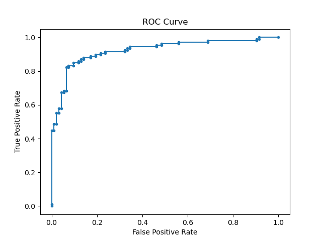
Evaluating the performance of a classification model using ROC curves can provide deep insights into the model’s behavior. The roc_curve() function from scikit-learn helps plot the ROC curve, which visualizes the trade-off between the true positive rate and the false positive rate at various threshold settings.
The ROC curve is calculated by computing the true positive rate (TPR) and the false positive rate (FPR) for different threshold values. A model with a curve closer to the top-left corner indicates better performance, while a model with a curve near the diagonal suggests poor performance.
ROC curves are primarily used for binary classification problems. However, they are less suitable for imbalanced datasets where the positive class is rare, as the ROC curve may present an overly optimistic view of the model’s performance.
from sklearn.datasets import make_classification
from sklearn.model_selection import train_test_split
from sklearn.svm import SVC
from sklearn.metrics import roc_curve
import matplotlib.pyplot as plt

# Generate synthetic dataset
X, y = make_classification(n_samples=1000, n_classes=2, random_state=42)

# Split into train and test sets
X_train, X_test, y_train, y_test = train_test_split(X, y, test_size=0.2, random_state=42)

# Train an SVM classifier
clf = SVC(kernel='linear', probability=True, random_state=42)
clf.fit(X_train, y_train)

# Predict probabilities on test set
y_probs = clf.predict_proba(X_test)[:, 1]

# Calculate ROC curve
fpr, tpr, thresholds = roc_curve(y_test, y_probs)

# Plot ROC curve
plt.plot(fpr, tpr, marker='.')
plt.xlabel('False Positive Rate')
plt.ylabel('True Positive Rate')
plt.title('ROC Curve')
plt.show()
Running the example gives an output like:
The steps are as follows:
- Generate a synthetic binary classification dataset using
make_classification(). - Split the dataset into training and test sets using
train_test_split(). - Train an
SVCclassifier on the training set, enabling probability estimates by settingprobability=True. - Use the trained classifier to predict probabilities on the test set.
- Calculate the ROC curve using
roc_curve()by comparing the true labels to the predicted probabilities. - Plot the ROC curve using
matplotlibto visualize the model’s performance.
First, we generate a synthetic binary classification dataset using the make_classification() function from scikit-learn. This function creates a dataset with 1000 samples and 2 classes, simulating a classification problem without relying on real-world data.
Next, we split the dataset into training and test sets using the train_test_split() function. This step ensures we can evaluate the classifier’s performance on unseen data. We allocate 80% of the data for training and the remaining 20% for testing.
We then train an SVM classifier using the SVC class from scikit-learn. We enable probability estimates by setting the probability parameter to True, which allows the classifier to output probability scores for each class. The fit() method trains the classifier on the training features (X_train) and labels (y_train).
After training, we use the classifier to predict probabilities on the test set with the predict_proba() method. This generates predicted probabilities for each sample in the test set.
We then calculate the ROC curve using the roc_curve() function, which takes the true labels (y_test) and the predicted probabilities (y_probs) as input. This function returns the false positive rate, true positive rate, and threshold values for plotting the ROC curve.
Finally, we plot the ROC curve using matplotlib. The plot shows the trade-off between the true positive rate and the false positive rate, providing a visual representation of the classifier’s performance.