
The make_s_curve function generates a 3D S-curve dataset, which is useful for testing manifold learning and visualization algorithms.
Key function arguments include n_samples to specify the number of data points and noise to add Gaussian noise to the data for more realistic scenarios.
This dataset is often used for visualization tasks and evaluating algorithms like Isomap, Locally Linear Embedding (LLE), and t-SNE.
from sklearn.datasets import make_s_curve
import matplotlib.pyplot as plt
from mpl_toolkits.mplot3d import Axes3D
# Generate the dataset
X, y = make_s_curve(n_samples=1000, noise=0.1, random_state=42)
# Display dataset shape and types
print(f"Dataset shape: {X.shape}")
print(f"Feature types: {type(X)}, {type(y)}")
# Show summary statistics
print(f"Summary statistics:\n{X[:5]}") # Displaying first 5 samples
# Plot the S-curve dataset
fig = plt.figure()
ax = fig.add_subplot(111, projection='3d')
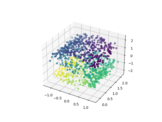
ax.scatter(X[:, 0], X[:, 1], X[:, 2], c=y, cmap=plt.cm.viridis)
plt.show()
Running the example gives an output like:
Dataset shape: (1000, 3)
Feature types: <class 'numpy.ndarray'>, <class 'numpy.ndarray'>
Summary statistics:
[[-1.01332776  0.55736238  0.6559955 ]
 [-0.97673069  1.12276331 -1.19682619]
 [ 0.79372434  1.6590624  -1.76153387]
 [ 0.83825742  1.51791268 -0.40526126]
 [ 0.19154538  1.34954752  2.05902293]]
2024-06-07 10:37:37.862 Python[94718:10800783] +[CATransaction synchronize] called within transaction
The steps are as follows:
Import the
make_s_curvefunction fromsklearn.datasetsand necessary plotting libraries:make_s_curvegenerates the S-curve dataset, whilematplotlibandAxes3Dare used for visualization.
Generate the dataset using
make_s_curve():- Use
n_samples=1000to create a dataset with 1000 points andnoise=0.1to add some Gaussian noise. - Set
random_state=42for reproducibility.
- Use
Print the dataset shape and types:
- Check the shape using
X.shapeand print the types ofXandy.
- Check the shape using
Display summary statistics:
- Show the first 5 samples of the dataset to get an idea of the data points.
Plot the S-curve dataset:
- Create a 3D scatter plot with color coding based on the target variable
y.
- Create a 3D scatter plot with color coding based on the target variable
This example demonstrates how to generate and visualize the S-curve dataset using make_s_curve() from scikit-learn. It provides a way to inspect the data’s structure and visualize it in 3D, setting the stage for further manifold learning or visualization tasks.